As an Amazon Associate I earn from qualifying purchases.

This post may contain affiliate links. If you buy through them, The Funny Beaver may earn a commission at no extra cost to you.

32 Horrible and Totally Absurd Logo Designs
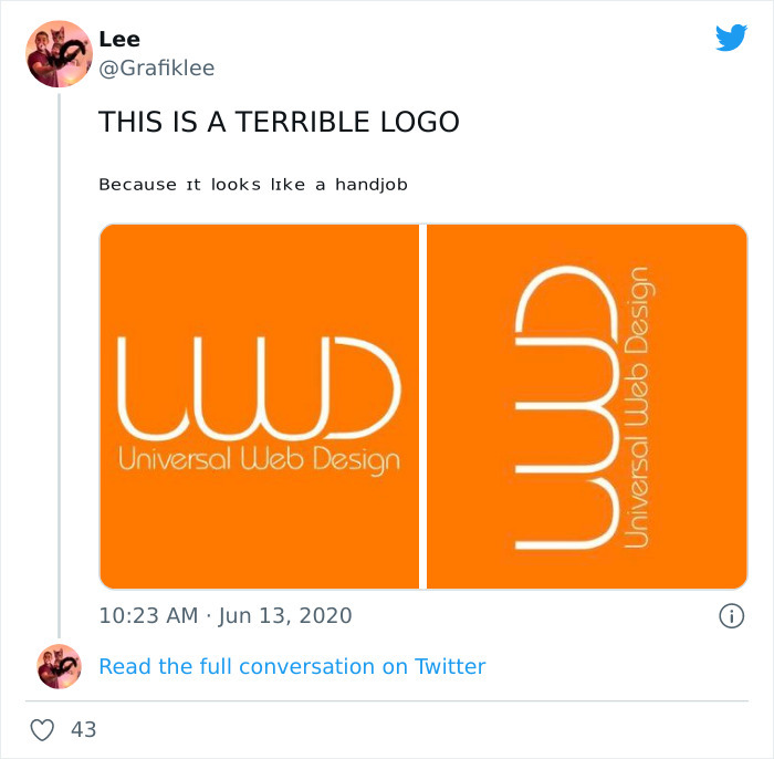
Tweet calling the orange Universal Web Design logo terrible because of its suggestive shape

Wow. the fact that this person noticed that is crazy 
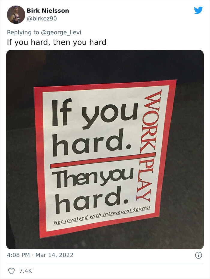
Workplace safety poster that reads If you hard, then you hard, with words awkwardly split

These type of signs never go well 

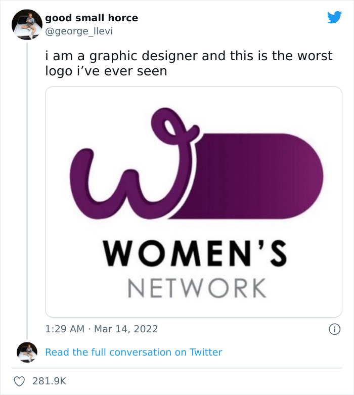
Purple Women's Network logo whose W shape was widely mocked as a terrible design

some graphic designers need to rethink their life choices lol 
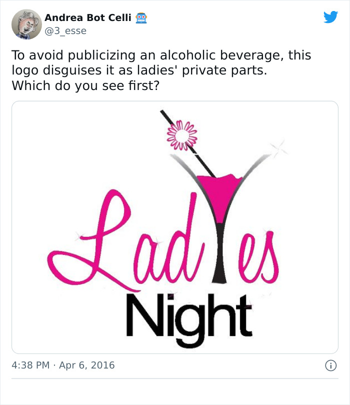
Ladies Night cocktail logo where the glass and letters form an unintended suggestive shape

Holiday Gift Guides

Funny gifts people will actually fight over in a white elephant swap

i definitely see this beverage first lol 
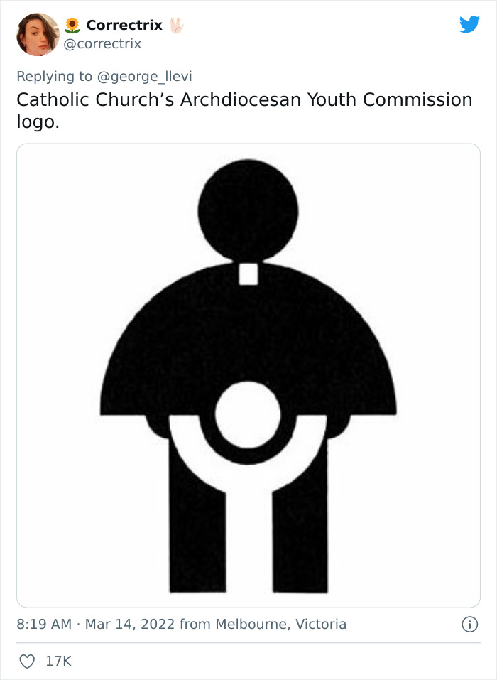
Black Catholic youth commission logo whose figure shapes were widely seen as inappropriate

Oh no 

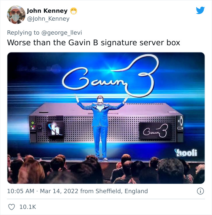
Tweet comparing bad logos to the Gavin B signature server box from a TV comedy

Who is gonna tell him lol 

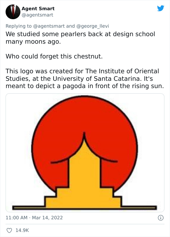
Red rising sun with a yellow pagoda logo for an oriental studies institute that looks like a backside

Thats not what it looks like lol 

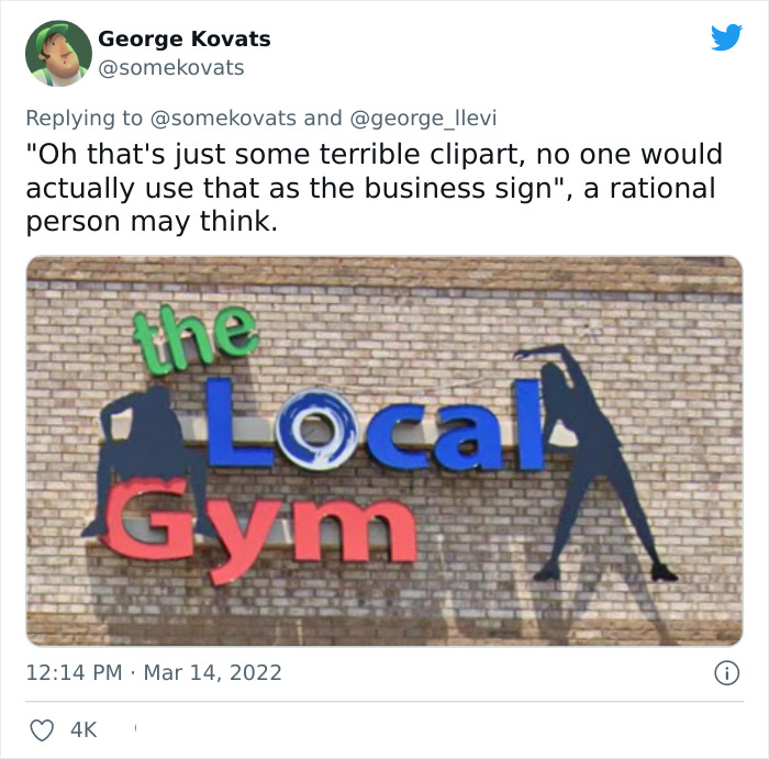
The Local Gym sign whose two silhouettes look like they are doing something else

guess not everyone is as rational as we would think lol 
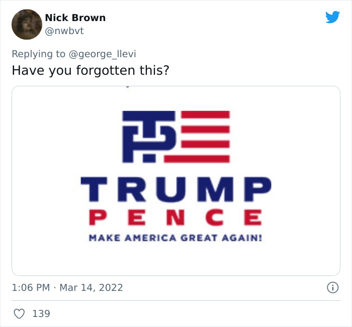
Red, white and blue 2016 presidential campaign logo with oddly interlocking letters

trump never did anything right smh 

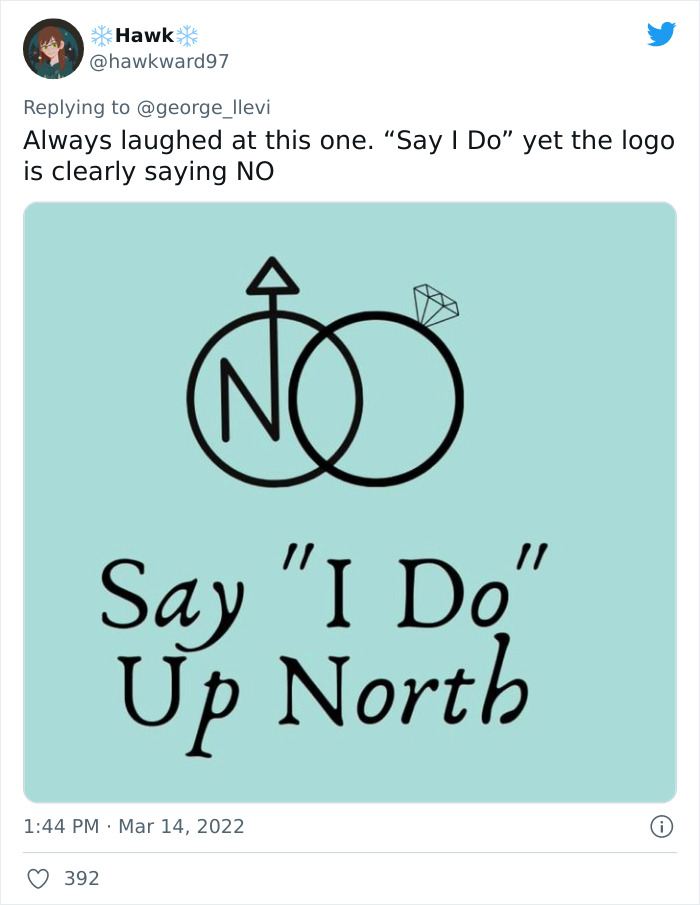
Say I Do Up North wedding logo whose rings clearly spell out the word NO

Mixed signals 

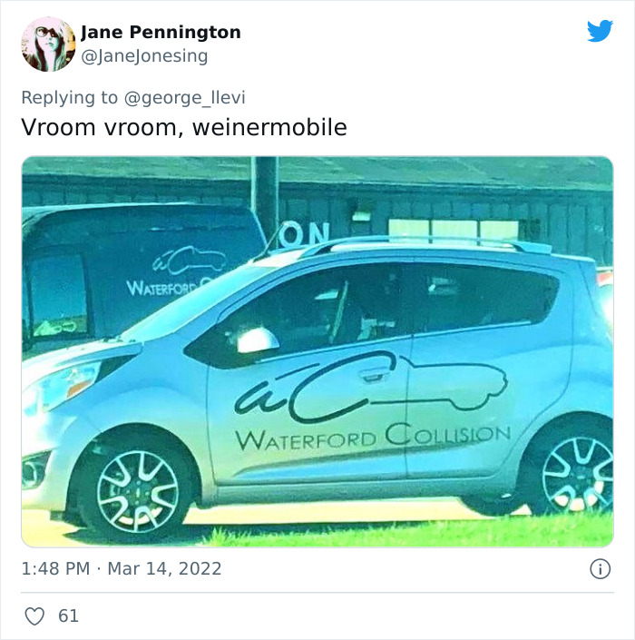
Waterford Collision car decal with a car outline that looks like a sausage on wheels

HAHAHAHA halarious 

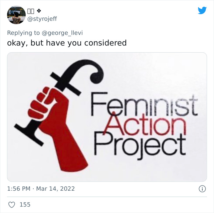
Feminist Action Project logo with a raised fist holding a plunger-shaped F

HAHAHA when you see it , youll laugh 

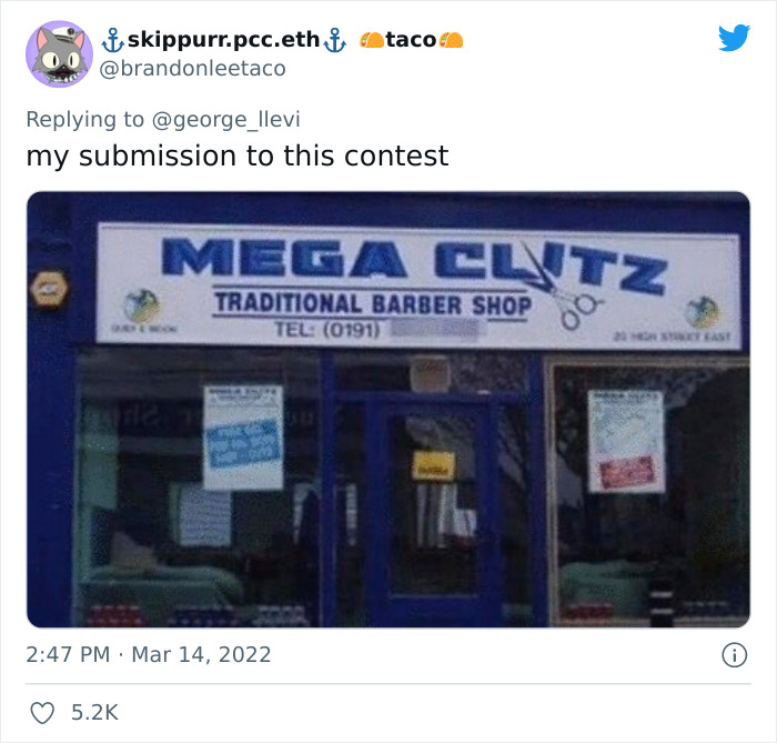
Blue and white traditional barber shop sign with an unfortunate misspelled name

This is just poor planning lol 

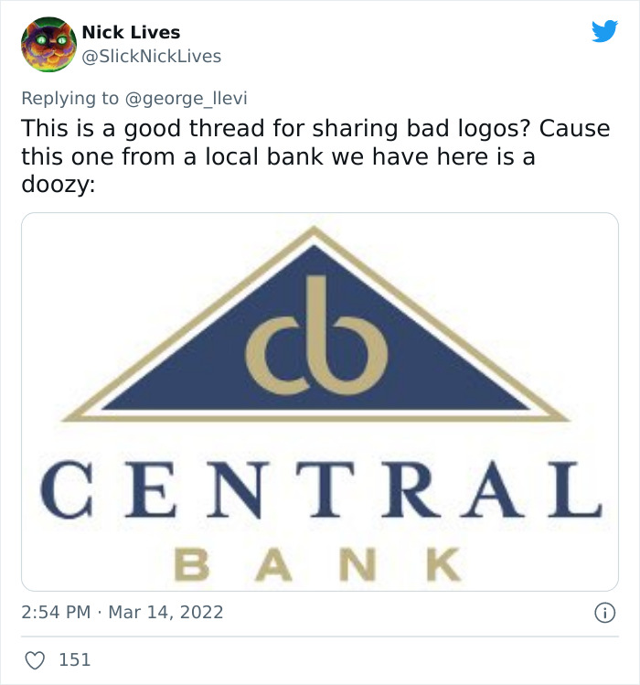
Central Bank logo with a C and B in a triangle that looks suggestive

lol 

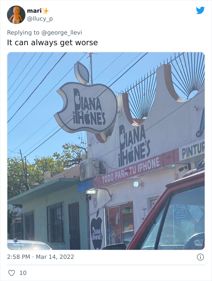
Diana iPhones repair shop sign shaped like an Apple logo with a cut-out face

I actually have no idea what this is saying lol 
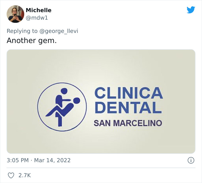
Clinica Dental San Marcelino logo whose two figures appear to be in an awkward pose

I will not be going to this dental clinic 
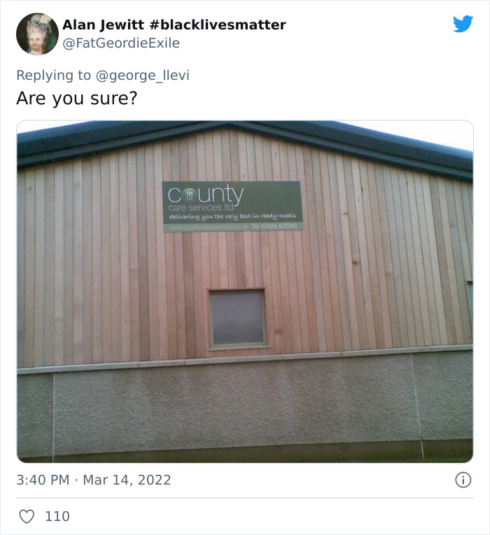
Wooden building with a County sign where the O is a heart and reads differently

NOOOOO do people not review their work lol 
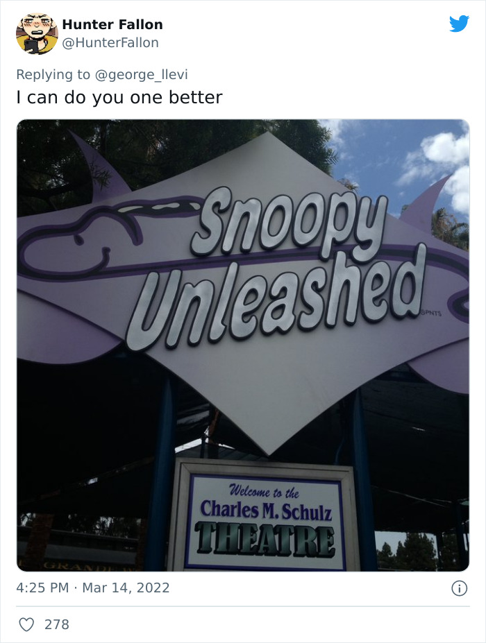
Snoopy Unleashed sign at the Charles M. Schulz Theatre with an unfortunate gap in the letters

some one leash snoopy again asap ! 

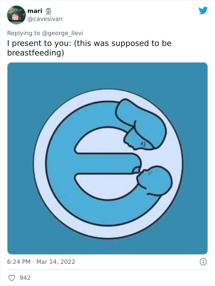
Blue breastfeeding logo with abstract shapes that look like something else entirely

ahhh yes this is how you do it 

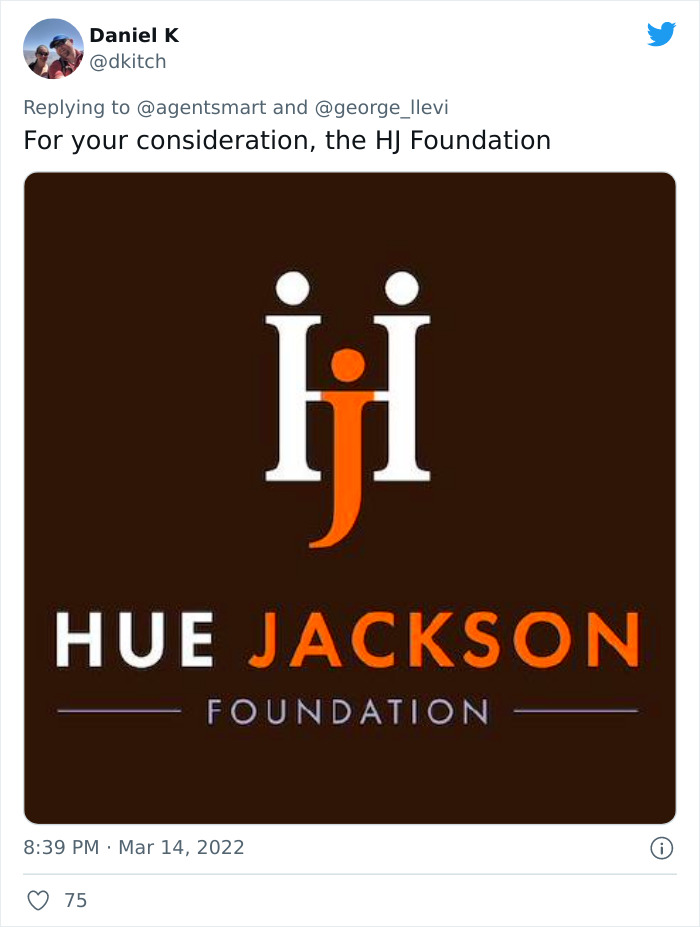
HJ Foundation logo where the H and J letters look like two figures

Im not gona say it , those who get it get it lol 
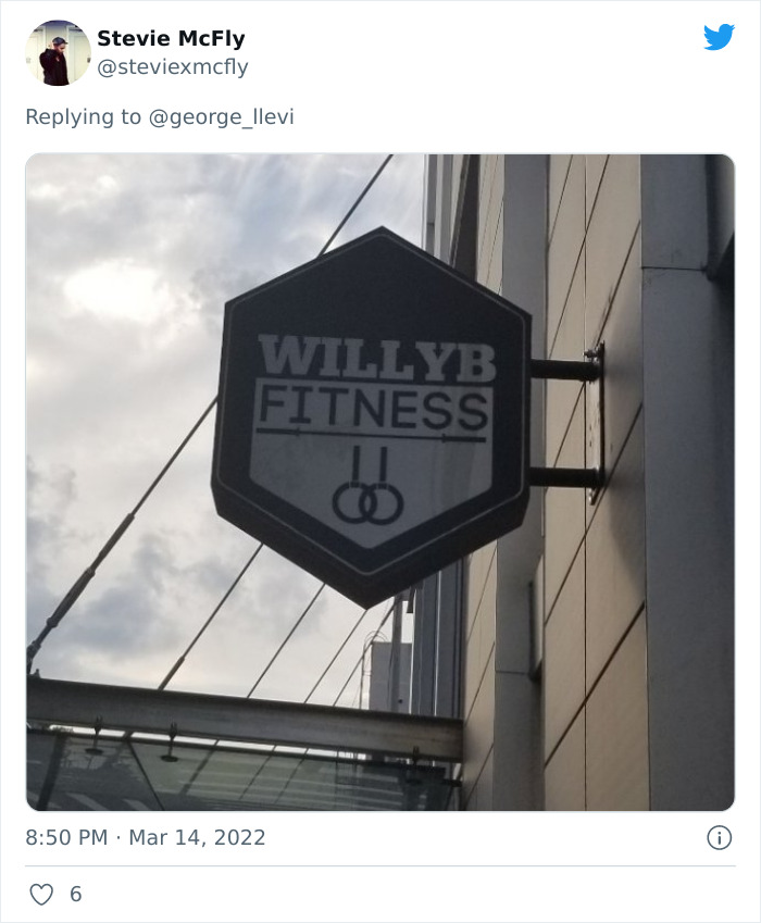
Willy B Fitness hexagon sign on a building with a suggestive name

i wonder what they do in there 

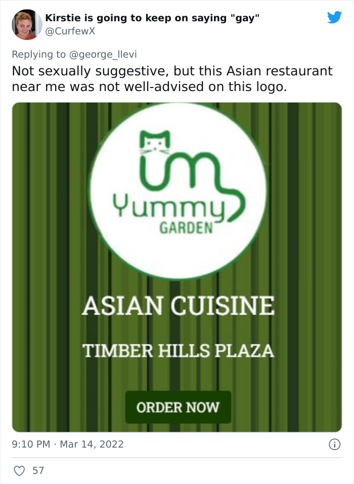
Yummy Garden Asian cuisine restaurant logo with a cat face and a suggestive outline

oh no lol 

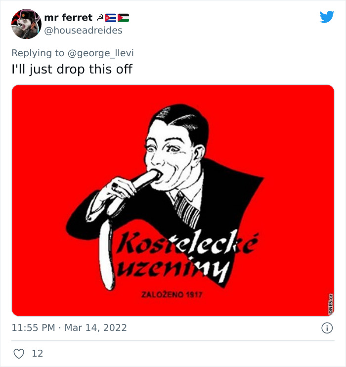
Red Czech sausage brand logo of a man in a suit eating a long sausage

no comment 

Orange logo for a religious school in Lleida, Spain whose emblem looks anatomical

uhhhh thats looks like ….. you know what never mind lol 

Brescia University College logo whose bird and tree emblem looked like a backside to some

nothing to worry about at all lol 

Year of the Monkey 2016 logo where the monkey looks like it sits in the number 0

not the best chinese new year logo 

Boat cruise logo of a green figure bending in an arc that looks like a swim in sewage

this is just bad 

Welcome to Woodbury sign with letter spacing that makes it read wrong

this is not a bad idea lol 

Year of the Monkey 2016 graphic with a pink monkey face that looks like a backside

another one lol 

Blue Volda municipality coat of arms in Norway with a fountain pen emblem

hahaha

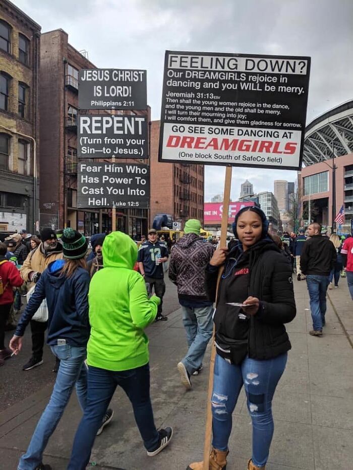
Street preacher signs next to a Dreamgirls dance club ad sign in a busy crowd

smh 

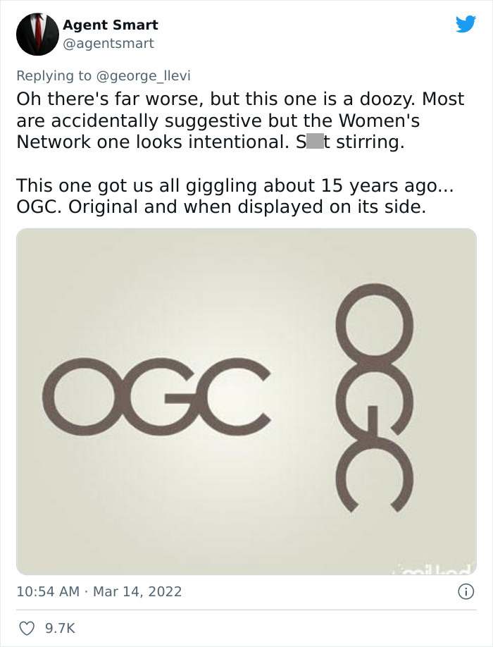
OGC logo of three rings that reads very differently when displayed on its side

who designs these lol 

Next Page >